Design that get’s under the skin of your needs
A focused, inclusive design approach and delivery for web and print
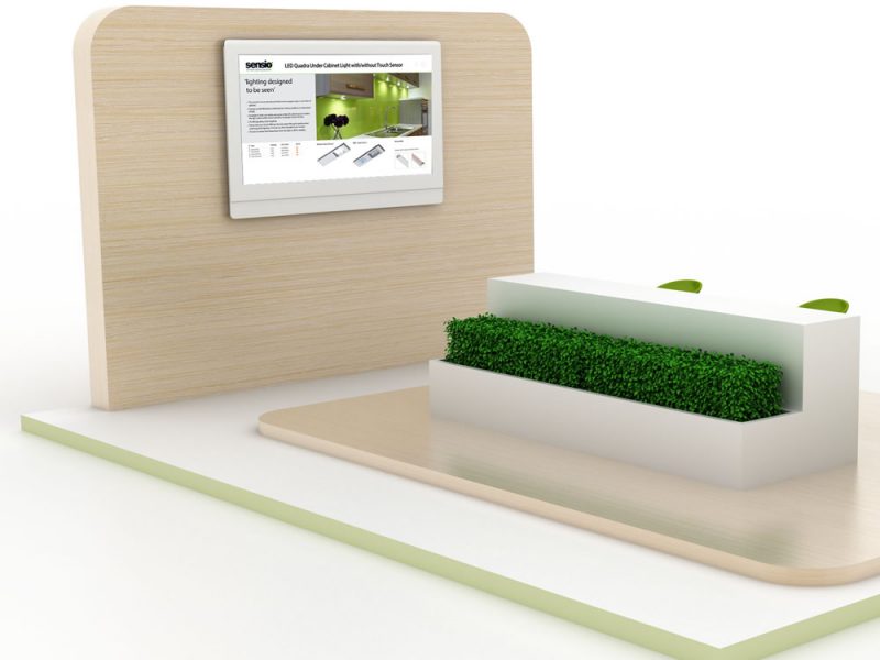
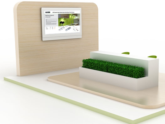
Sensio Exhibition Kiosk
We are often asked to develop materials for exhibitions and the opportunity to bring the digital and print world together is always a great creative opportunity.
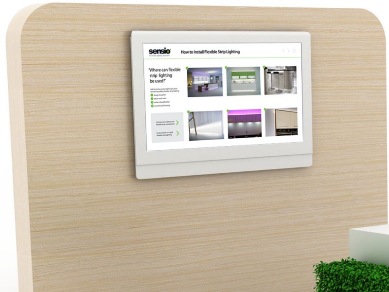
We were asked to turn the Sensio catalogue into an interactive presentation tool for the main industry show of the year.
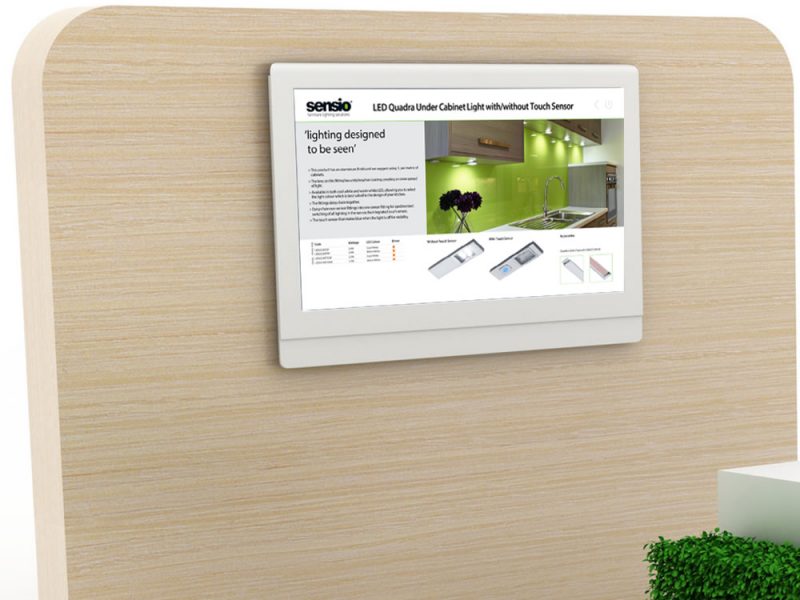
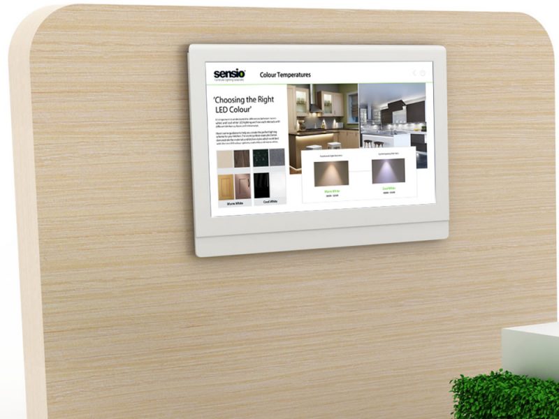
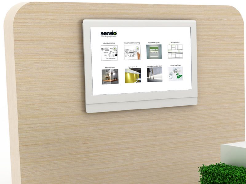
Our task was to bring the print catalogue to life, develop an intuitive navigation system and work with our video partner to integrate custom content, whilst maintaining brand consistency.
Client:
Sensio
Location:
Castleford, Wakefield
Skills:
- Brand Development
- Interactive Screen Development
- GUI Development.
Approach
Effectively our first step was to look at the core visual elements of the catalogue and set out against the chosen screen and resolution. This provided clarity on the amount of content that could be displayed coherently and legibly From here we set a site map of contents and paths for navigation. This along with core brand guidelines provided us with the structure
to develop to.
Solution
White space was key to preserving the impact of the product visuals with content distilled down to essentials allowing the presenter to draw out from the detail and explore and engage with potential clients.
Every section was designed so that it was never more than three clicks away ensuring smooth and quick use in demonstration settings. and
Results
A clean, brand enhancing, intuitive and easy to use digital kiosk catalogue and presentation tool.
Upgrade paths for new content and multi year lifecycle built in allowing a strong ROI.
Successful implementation at the event with positive user and viewer experiences expressed on both sides at the event.
