Design that get’s under the skin of your needs
A focused, inclusive design approach and delivery for web and print
Sightsonic
Sometimes you get free reign and the type of open brief that provides for exploration. On these occasions we accept with open arms and run with it.
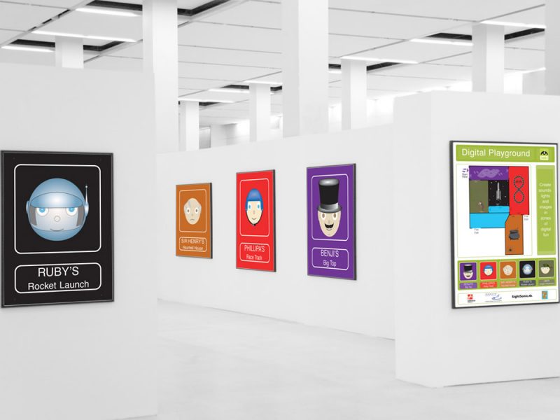
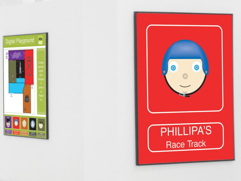
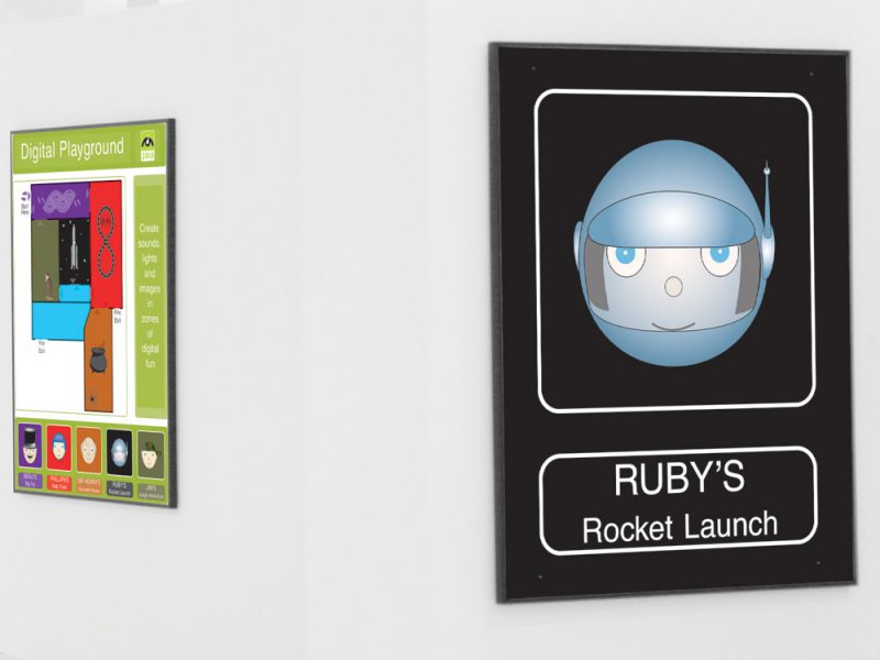
We were required to zone, map and sign a temporary interactive play event area for children.
As such it had to be intuitive, easily comprehended and visually age appropriate whilst giving a sense of what was on offer in each of those areas.
Client:
Sightsonic
Location:
York
Skills:
- Illustration
- Signage
- Character Development
Approach
Each of the play zones had its own distinctive theme and activity and this is where we drew inspiration from.
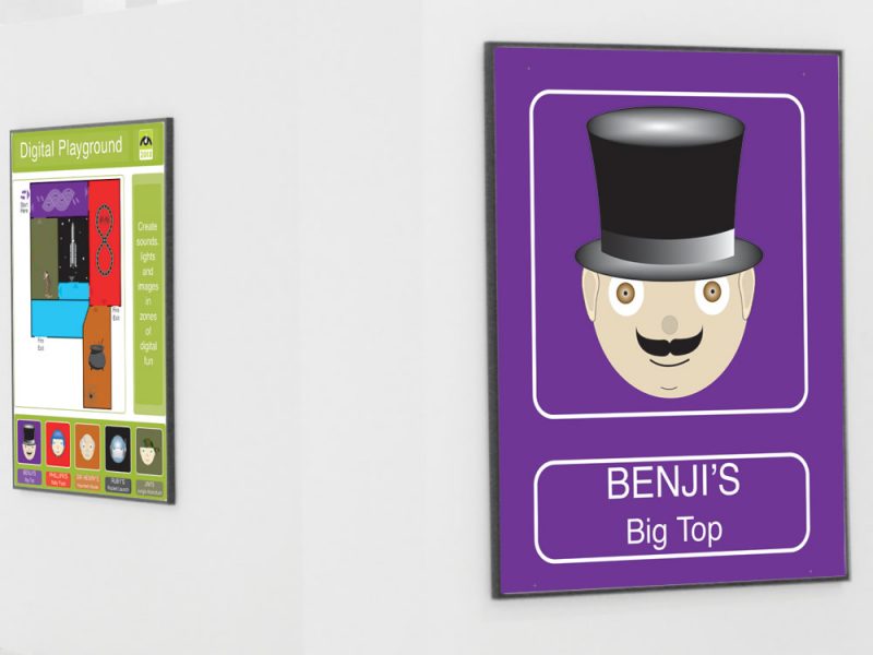
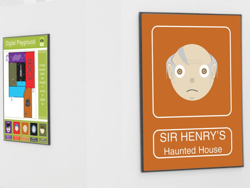
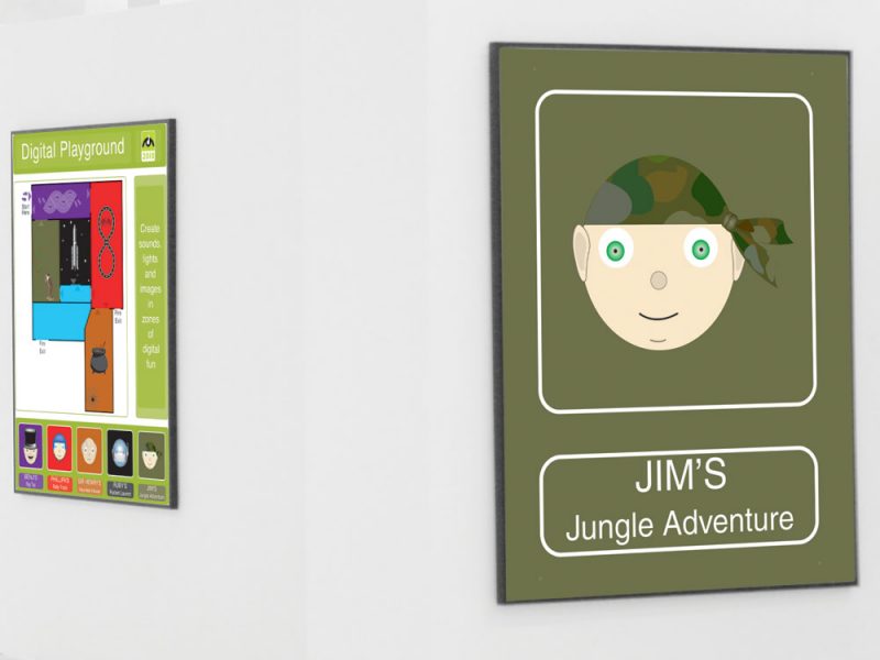
We wanted to build on their identities and reinforce through the use of a character to associate with that zone.
From here a colour coding pallet presented itself again to aid flow and movement around the event
Solution
Each play zone presented a theme and here we developed a charachter to represent those zones.
By nature this suggested a primary colour code for that zone and set the pallet and tone for how we went about building the signage.
Furthermore as the charachters were vector designed and drawn we wanted to maintain that look and feel in the signage
Results
A strong, attractive and easily understood signage and mapping system was developed and deployed ensuring that all visitors were easily able to navigate and enjoy the experience.
